Although Hopper often has a sad undertone. This looks happy: You've spent most of the day in the ocean, and now you're ready for your book and maybe a nap.
My first reaction was, "Yay! Seaside! Book!" but then the room started to feel too small. And the bright light - reading related dehydration headaches! And that clock seemed to be reminding me I didn't have all day. Like on holiday where you're supposed to be relaxing but you worry you're wasting the experience and then it turns all stressful.
Uh, this probably reveals way too much about my psyche. Um. So. Uh.
*scuttles off before accidentally revealing where the bodies are*
The Disagreement is filarious, Kitty. Thanks for including it.
I try to understand art like I try to write poetry, which is to say, rather unsuccessfully, but I really like this.
I'm just stumped trying to figure out why that darned clock is there, making all kinds of promises like Chekhov's gun. The alarm's gotta go off by the third act, by which time there won't be light coming ominously through the window...
Art paralleling writing. Both take an incredible amount of work to get to the point of making something seem simple.
I, too, love the light. It draws you in first and then your mind goes the way it wants, to the sea or to the book, both an equal distance from the light.
Ah, this makes me feel like I'm on vacation. And the good kind, where you're there with only your significant other, and you had an early morning walk on the beach, and a margarita at lunch (for lunch?), and a good writing day, and you're going to a fun movie that night.
I wonder how different the painting would feel if we replaced the alarm clock with something else: a pocket watch, a vase of peonies, a chipped mug, a revolver.
I want to be there. For me, the clock is just right. Just the basics, one book, one clock, no curtains, no clutter. The exact opposite of my own bedroom.
I don't dislike the painting as a painting, but no way do I want to be in that room! It's far too sterile and un-cosy.
I hope the other title for this painting is "Contrast". A flat, boring, sterile room and a cracking story with colourful and interesting characters and worlds.
It's growing on me. I've been sitting here looking at it and at first I thought it was sad, but as I've been staring at it I'm liking it more and more, and it isn't sad now.
I've been coming back to this picture all day, trying to figure out why it bugs me. I think I finally know.
[disclaimer: I do not understand art]
I like art that tells a story. At first glance, this tells a story of a book carelessly abandoned in favour of perhaps a walk on the beach, an afternoon sailing, or maybe just a forage in the kitchen for a snack. A pleasant, idyllic vacation. Except . . . no one lying or even sitting there reading would carelessly abandon a book, only to precisely make the bed before wandering off. That bed is perfect. The weight of the book doesn't even make a small dent. It barely casts a shadow.
So with this realization the story changes. It feels contrived and untrue. Now it tells a story of someone who was not lying/sitting there reading, but someone who deliberately placed that book, pages carefully open, to *seem* as if someone there had been distracted from reading.
I don't like that second story. It's disturbing. I don't know, maybe that's the point.
Speaking of art, our own incredibly talented Panda in Chief (aka Anne Belov) currently has an exhibit on display at a gallery and her paintings are AMAZING. She has one featuring a similarly open abandoned book [titled Shelter] that doesn't make me feel disconcerted. And another [titled Front Desk] that immediately made me think of that famous Hopper piece Lawrence Block used as a cover for one of the anthologies he edited a couple years back.
Anyway. Not sure we're allowed to live-link to stuff like this (because, commercial promotion), but if anyone wants to copy-paste, Anne's work is currently featured here: https://www.robschoutengallery.com/annebelov
Thanks for the mention, k.d. and the link, Janet! If you can't tell from my paintings, I am a huge devotee of Edward Hopper. Last summer I did a few copies of his drawings for our local biennial forgery show. Truth be told, I love his drawings far more than his paintings. If the museums in NYC ever open up again, I hope all you New Yorkers will make the trek to the Whitney, because they have one of the best collections of Hoppers drawings and etchings anywhere.
I really responded to Jim Holland's painting, like Hopper, he fills empty space with light and variations of value. Painting empty space is very tricky. The more stuff in a painting, the easier it is to get people lost in the details. (This is why I usually cram my paintings full of stuff.) When I was in graduate school, I had the phenomenal good fortune to have Jacob Lawrence as one of my faculty advisors. Almost 40 years later, I still remember one bit of advice he gave me: "Belov," he said, "don't paint a wall like you're painting a wall." Mr. Holland does this beautifully. The fact that people are having different reactions to this painting, concerning the narrative, tells me he did his job well.
Spare painting, like spare writing, is really hard to pull off.
Panda, that interview with you at the gallery webpage is great. I loved the girl at the desk you were painting - is it finished? Be curious to see how it turns out.
I googled Edward Hopper because I wasn't familiar with the name, and realised I did know and love one of his paintings - Ground Swell.
24 comments:
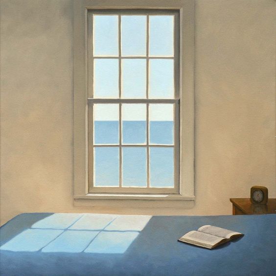
It's reminiscent of Edward Hopper's work.
Love this. An open book. A window upon the world.
Very much so, Kitty!
Although Hopper often has a sad undertone. This looks happy: You've spent most of the day in the ocean, and now you're ready for your book and maybe a nap.
Lovely. Evokes a wish to step into the painting, open the window, turn the clockface to the wall, curl up and finish the book.
*sigh*
I love the lighting he plays with in his paintings and he does it so well.
Holland has a sense of humor, too, InStained, like his The Disagreement.
My first reaction was, "Yay! Seaside! Book!" but then the room started to feel too small. And the bright light - reading related dehydration headaches! And that clock seemed to be reminding me I didn't have all day. Like on holiday where you're supposed to be relaxing but you worry you're wasting the experience and then it turns all stressful.
Uh, this probably reveals way too much about my psyche. Um. So. Uh.
*scuttles off before accidentally revealing where the bodies are*
(But I loved the use of light!)
LOVE
The Disagreement is filarious, Kitty. Thanks for including it.
I try to understand art like I try to write poetry, which is to say, rather unsuccessfully, but I really like this.
I'm just stumped trying to figure out why that darned clock is there, making all kinds of promises like Chekhov's gun. The alarm's gotta go off by the third act, by which time there won't be light coming ominously through the window...
Art paralleling writing. Both take an incredible amount of work to get to the point of making something seem simple.
I, too, love the light. It draws you in first and then your mind goes the way it wants, to the sea or to the book, both an equal distance from the light.
I want the house that goes with that painting...and some window-framing curtains...and a cat...and a dog...and a frozen strawberry margarita.
Ah, this makes me feel like I'm on vacation. And the good kind, where you're there with only your significant other, and you had an early morning walk on the beach, and a margarita at lunch (for lunch?), and a good writing day, and you're going to a fun movie that night.
Although Nicola, your assessment cracked me up.
I wonder how different the painting would feel if we replaced the alarm clock with something else: a pocket watch, a vase of peonies, a chipped mug, a revolver.
I want to be there. For me, the clock is just right. Just the basics, one book, one clock, no curtains, no clutter. The exact opposite of my own bedroom.
I don't dislike the painting as a painting, but no way do I want to be in that room! It's far too sterile and un-cosy.
I hope the other title for this painting is "Contrast". A flat, boring, sterile room and a cracking story with colourful and interesting characters and worlds.
I guess I'm the outlier here but that's okay.
Actually, Katja, I'm with you. This painting makes me very uncomfortable. Interesting that there can be such polar reactions to it!
It's growing on me. I've been sitting here looking at it and at first I thought it was sad, but as I've been staring at it I'm liking it more and more, and it isn't sad now.
I've been coming back to this picture all day, trying to figure out why it bugs me. I think I finally know.
[disclaimer: I do not understand art]
I like art that tells a story. At first glance, this tells a story of a book carelessly abandoned in favour of perhaps a walk on the beach, an afternoon sailing, or maybe just a forage in the kitchen for a snack. A pleasant, idyllic vacation. Except . . . no one lying or even sitting there reading would carelessly abandon a book, only to precisely make the bed before wandering off. That bed is perfect. The weight of the book doesn't even make a small dent. It barely casts a shadow.
So with this realization the story changes. It feels contrived and untrue. Now it tells a story of someone who was not lying/sitting there reading, but someone who deliberately placed that book, pages carefully open, to *seem* as if someone there had been distracted from reading.
I don't like that second story. It's disturbing. I don't know, maybe that's the point.
Speaking of art, our own incredibly talented Panda in Chief (aka Anne Belov) currently has an exhibit on display at a gallery and her paintings are AMAZING. She has one featuring a similarly open abandoned book [titled Shelter] that doesn't make me feel disconcerted. And another [titled Front Desk] that immediately made me think of that famous Hopper piece Lawrence Block used as a cover for one of the anthologies he edited a couple years back.
Anyway. Not sure we're allowed to live-link to stuff like this (because, commercial promotion), but if anyone wants to copy-paste, Anne's work is currently featured here: https://www.robschoutengallery.com/annebelov
Hmmm. Apparently Block ended up using a different Hopper piece on the cover of that anthology, but Nighthawks is the one I meant.
I'm always glad to have links to the work of blog readers!
Panda!
Thanks for the mention, k.d. and the link, Janet! If you can't tell from my paintings, I am a huge devotee of Edward Hopper. Last summer I did a few copies of his drawings for our local biennial forgery show. Truth be told, I love his drawings far more than his paintings. If the museums in NYC ever open up again, I hope all you New Yorkers will make the trek to the Whitney, because they have one of the best collections of Hoppers drawings and etchings anywhere.
I really responded to Jim Holland's painting, like Hopper, he fills empty space with light and variations of value. Painting empty space is very tricky. The more stuff in a painting, the easier it is to get people lost in the details. (This is why I usually cram my paintings full of stuff.) When I was in graduate school, I had the phenomenal good fortune to have Jacob Lawrence as one of my faculty advisors. Almost 40 years later, I still remember one bit of advice he gave me: "Belov," he said, "don't paint a wall like you're painting a wall." Mr. Holland does this beautifully. The fact that people are having different reactions to this painting, concerning the narrative, tells me he did his job well.
Spare painting, like spare writing, is really hard to pull off.
You can "visit" the Whitney even when it's closed!
Panda, that interview with you at the gallery webpage is great. I loved the girl at the desk you were painting - is it finished? Be curious to see how it turns out.
I googled Edward Hopper because I wasn't familiar with the name, and realised I did know and love one of his paintings - Ground Swell.
Post a Comment